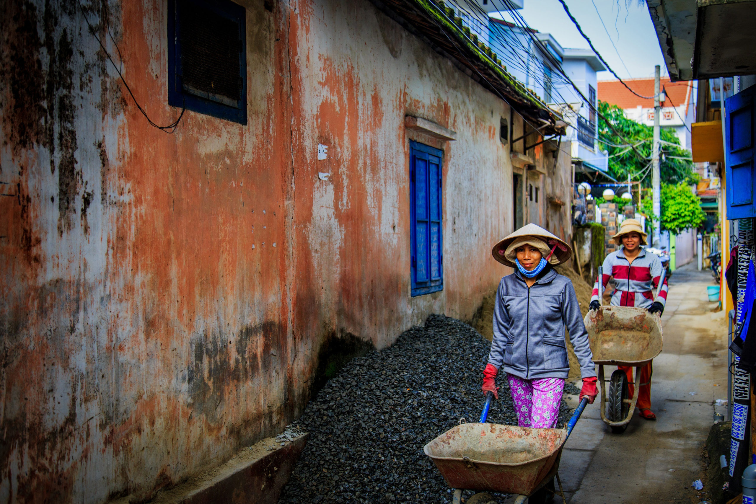
Also called the “workingman’s holiday,” Labor Day is a holiday for all Americans who labor for a living to call their own. It’s also a way of commemorating the evolution of equality and fairness in the American workplace. When we take a step back and look at workplace trends around the globe it gives perspective as to the real reason we celebrate this end of summer holiday.
In recognition of Labor Day and the worldwide fight for fair labor laws, here are six data-driven maps that show us the current state of the global labor force:
Note: For in-depth details and interactive features, click on the maps in each section.
1. Employment Contracts by Country
Labor Fact: In China, 90 percent or more workers do not have an employment contract.[1]
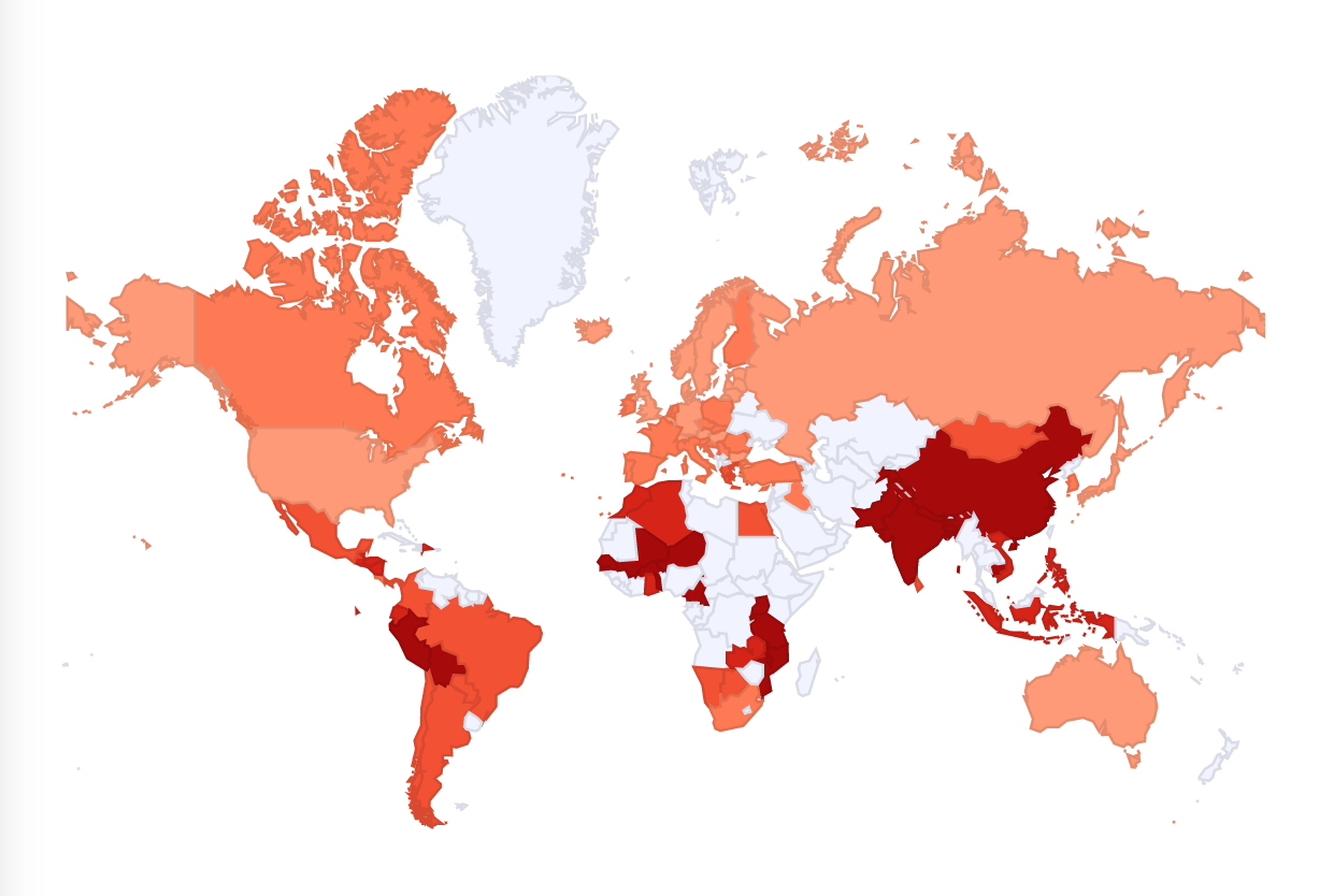
Employment contracts in the U.S. provide security for employees, allowing them to work happily knowing any unjust actions will not jeopardize their ability to make a living. However, while America’s rate of uncontracted employees is below the 25 percent threshold, the percentage abroad is sometimes less assuring. This map provides a detailed breakdown of each country and where their contract situation stands.
2. Worldwide Job Market Gender Gap
Labor Fact: In Mexico, the current gap between the number of women and men who are unemployed or looking for work is at 34 points, or 45.5 percent (women) to 79.5 percent (men).[2]
With Women’s Equality Day just passing and Labor Day fast approaching, this map couldn’t be more time-appropriate. It breaks down the global workforce’s gender gap and showcases several key gender-based employment statistics. Click through on the map to explore the interactive map.
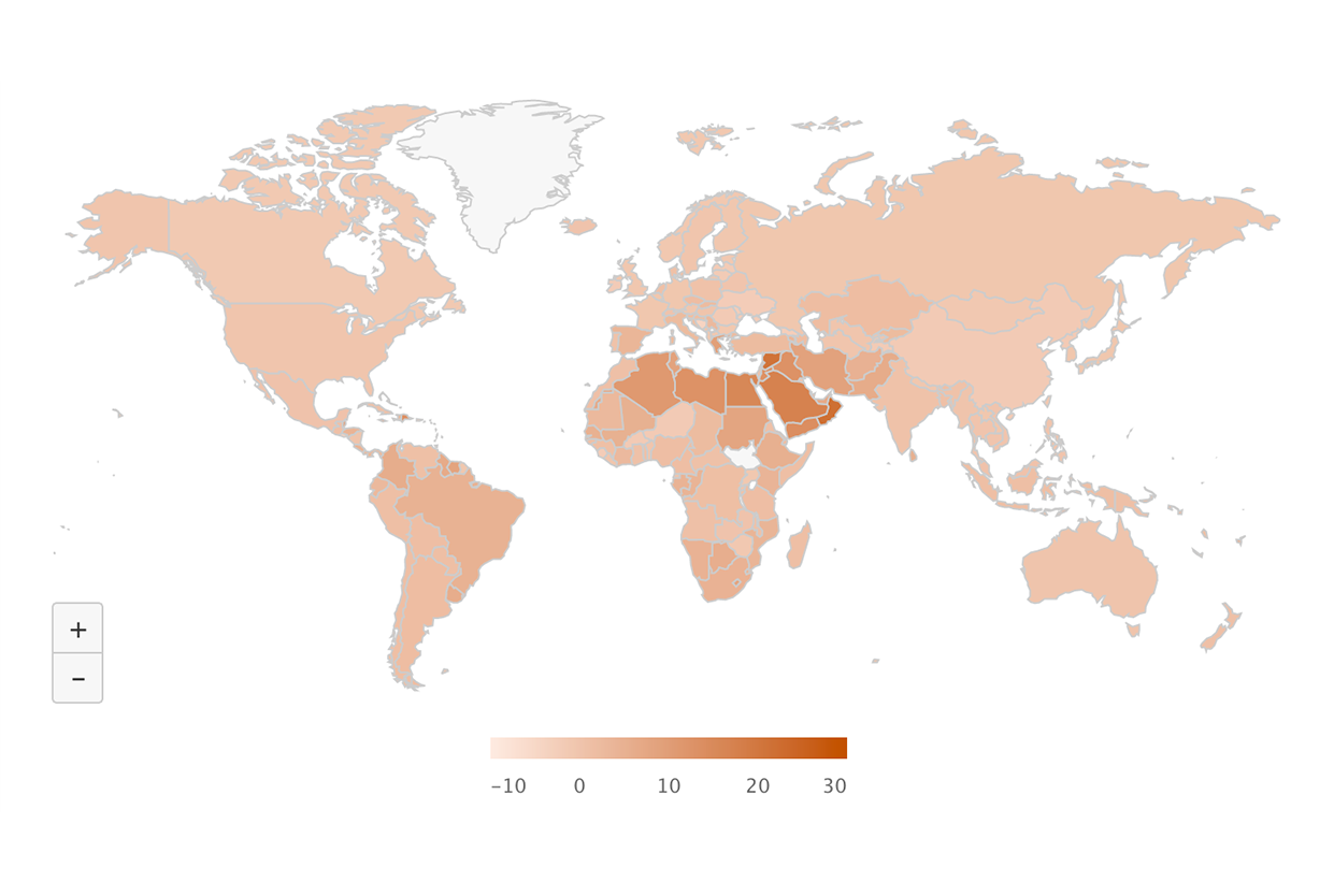
3. Economic Impact of Gender Equality
Labor Fact: In Algeria, if the gender gap were closed by 25 percent the country’s GDP (Gross domestic product) would grow by $2444 per person, or $81 billion.[3]
While the previous map’s data shows the variance in gender-based employment, this one shows us the economic benefits of equality, and they are eye-opening! The importance of data like this cannot be understated, as it is could ultimately help emphasize the importance of equality in countries that are behind the curve.
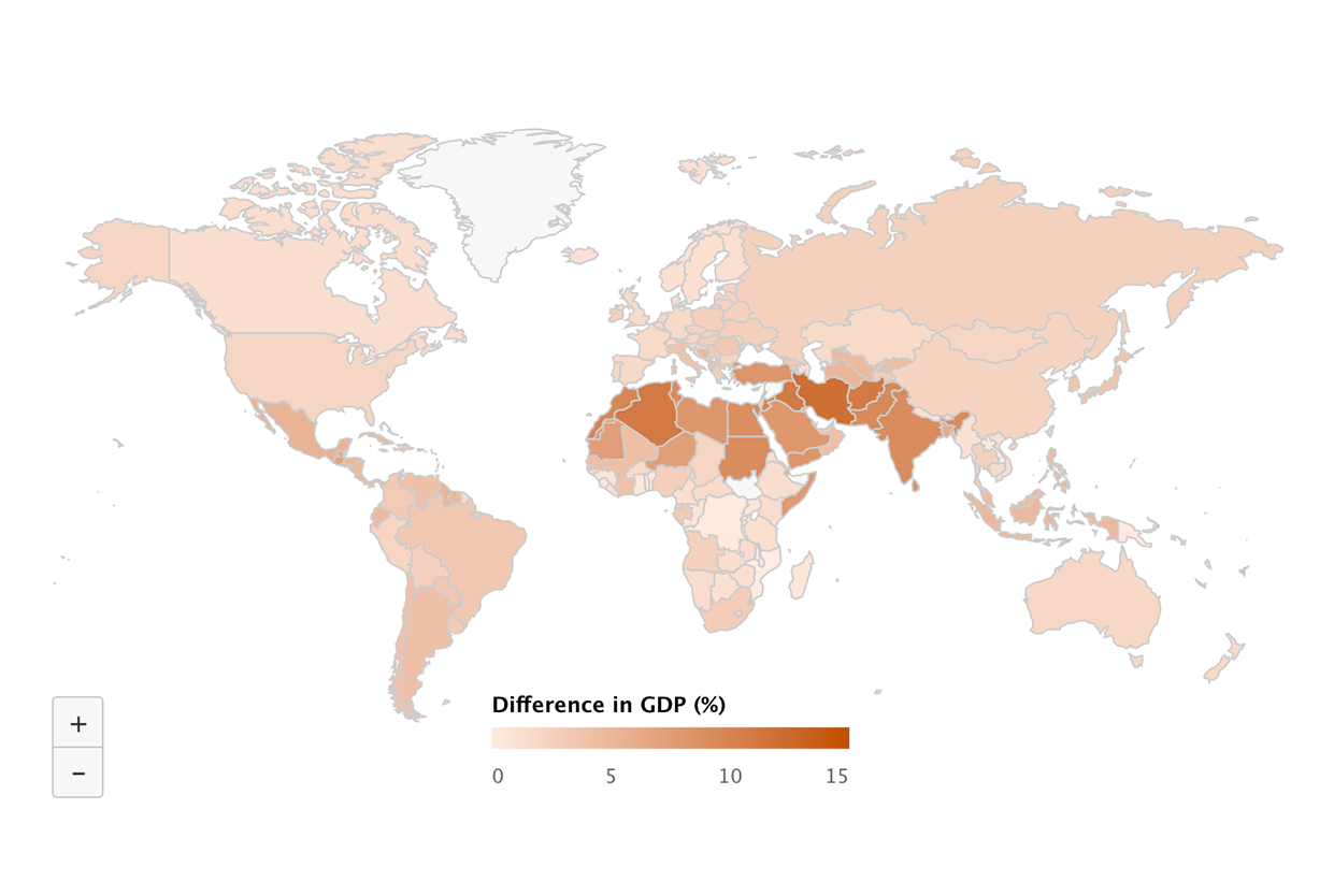
4. Equality Percentages by Country
Labor Fact: Ireland saw their rate of inequality drop by a margin of 4.2 percent from 1991 to 2011.[4]
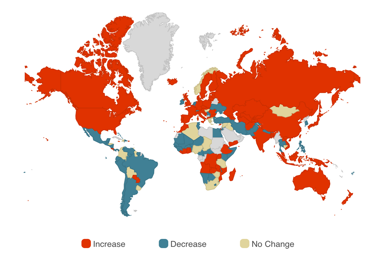
Equality, a central focus in the fight for fair labor and a prejudice free workplace, was trending downward in many major countries around the world from the year 1991 to 2010. While this map is a few years behind 2017, it shows us that while we are proud to celebrate Labor Day and the freedoms it represents, we still have work to do at home and abroad.
5. World Unemployment & Social Outlook
Labor Fact: In Afghanistan, 65 percent of workers live on less than the equivalent to $US 3.10 per day as a percentage of total employment.[5]
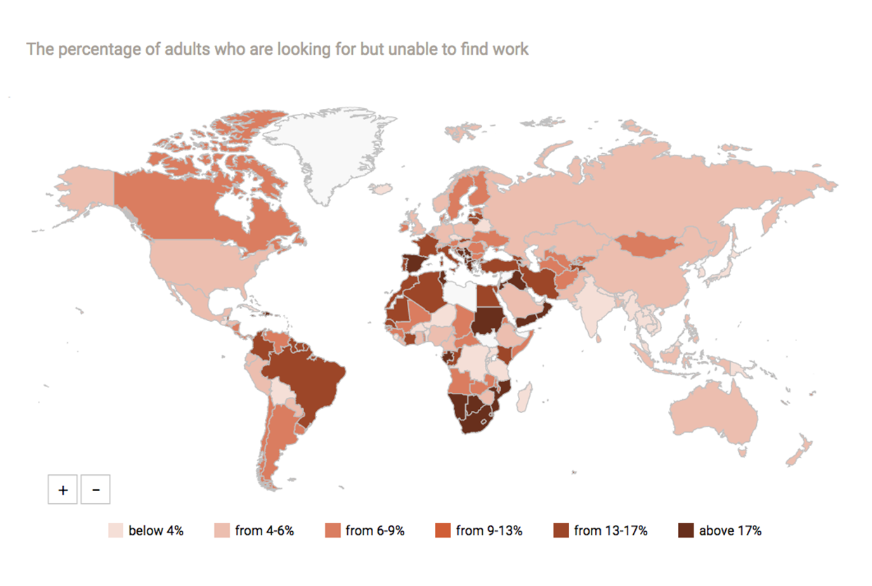
The U.S. celebrates Labor Day as an ode to the freedom and safety American workers have today, but not every country has such a day of celebration, nor the reasoning for celebrating it. This map shows the countries with the highest unemployment rates, worker poverty rates and unsafe working conditions.
6. Global Labor Force Participation
Labor Fact: The island of Madagascar has an 86.4 percent labor force participation rate.[6]
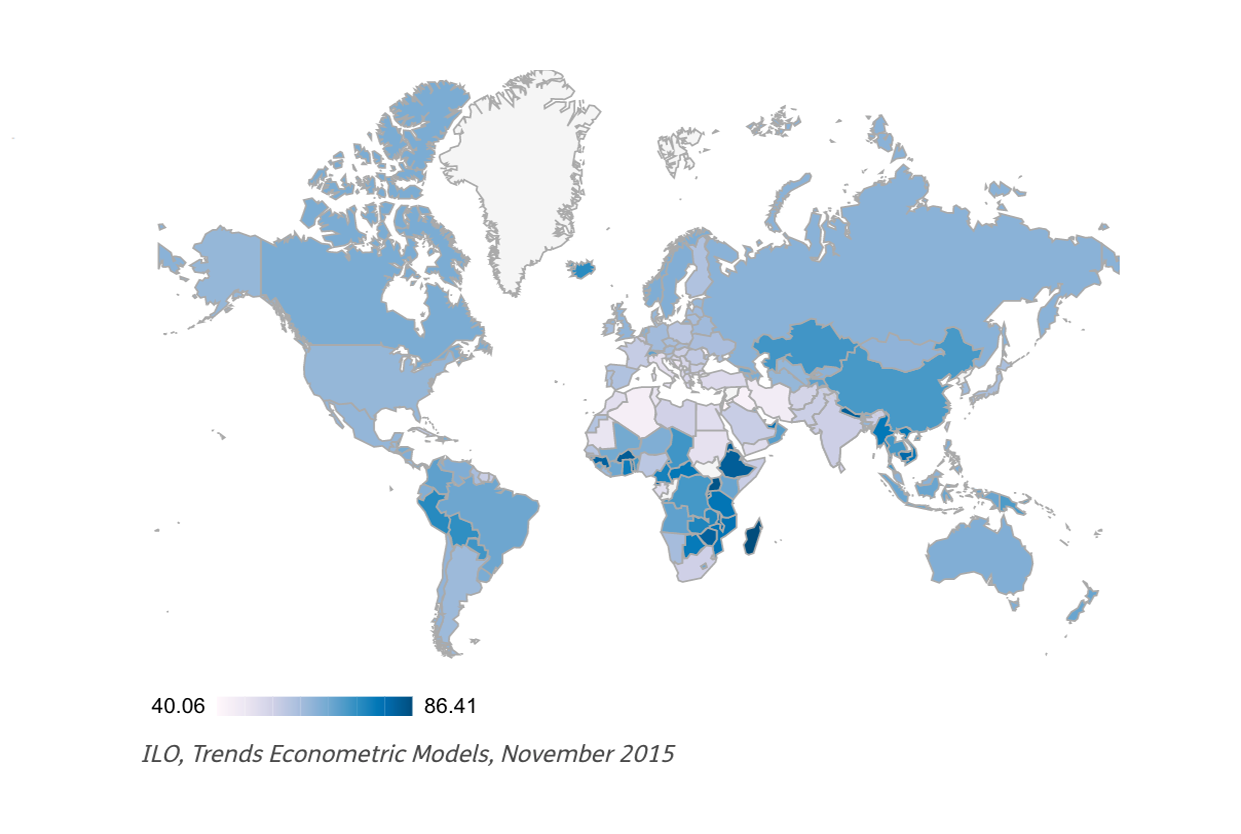
There are more than 2 billion people who are not participating in the labor market around the world. In 2015 that number jumped by about 26 million people. With a closer look at this map, you’ll notice that the only countries with a stable labor force participation rate are those with developing economies.