
You’ve got all your data in Salesforce. Whether it’s been there for 10 years or 10 months, you’ve got it all in there. Your team is successfully following business processes and the data is staying clean and up to date (well, as much as possible that is). They’re taking their notes, updating fields, and converting leads just like they’re supposed to. But now what?
Now it’s time to explore and analyze all of that wonderful data you have! While Salesforce reports and dashboards are great (they really are, we use them all the time), they have their limits. Without the ability to geographically visualize your data, you run the risk of missing trends, patterns, gaps, or opportunities in your business.
Let’s take a look at a few great tools that can help you and your team start visualizing your Salesforce data.
Heat Maps
One of the best options available to visualize your Salesforce data is heat maps. With 2D data visualizations that use color to represent values in a matrix, heat maps are a powerful diagnostic tool to gain greater insights to reveal any gaps or trends in your data.
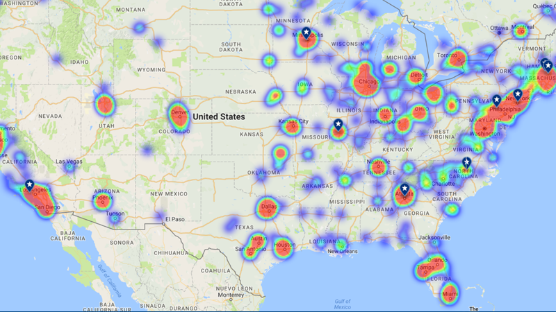
Using record count or any numeric values in Salesforce data, you can easily create heat maps that show you where that value is prevalent or, in some cases, lacking. Heat maps are great for seeing how your territories are performing, which products are selling in a geographic area, or maybe which areas have been neglected, along with a number of other use cases.
Thematic Maps
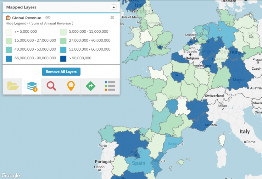
Next, let’s take a look at the lesser known, but just as powerful, thematic map. Similar to heat maps, thematic maps roll up a numeric value found in your Salesforce data. However, thematic maps differ from heat maps in how they display the data on the map. With thematic maps, the data is shown in preset geographic boundaries.
A great example of a use for thematic maps would be if you want to see how many won opportunities have closed in a specific territory. Thematic maps give you the ability to assign a color to a specific value range ($10K – $15K, $16K-$20K, etc.) and then see where those values lie in a territory.
Another great thing about thematic maps? You don’t necessarily need a developer to get them up and running! With apps like Geopointe, thematic maps are available right out-of-the-box and help you begin using geographic visualization of your Salesforce data quickly!
Charts
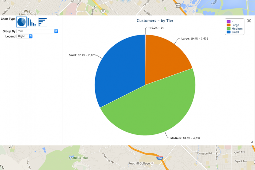
We’ve all sat in a meeting and had many charts presented to us. But did you know you can put your Salesforce data on a chart?
Apps like Geopointe are available to help you chart your Salesforce data using pie charts or bar graphs. You can use a variety of fields including state, opportunities, status, account type, any of your custom fields and many more. Take that wonderful data you’ve analyzed on the map and make it digestible during your presentations. Plus, you’ll still have access to a list view to accompany your chart.
Interested in learning more about what geo-analytics is? Click below!