
As businesses grow, the data grows with it. As the data grows, a big problem arises: how do you make sense of it all? Sure, reports and dashboards help to summarize. But having so many figures organized in raw form quickly becomes confusing.
The answer to this problem is really quite simple, and it’s backed by science. Humans are visual creatures by nature, so it’s time to lean into that with your data processes.
Using Geoanalytics, you can tap into instant comprehension of your data from the visual perspective your brain desperately needs.
The Science Behind Data Visualization
As mentioned, humans are highly visual. We process visual data much more easily than raw data on spreadsheets.
The human brain processes images 60,000 times more quickly than text. And according to research conducted by MIT, 90% of all information transmitted to the brain is, in fact, visual.
With this in mind, adding a data visualization solution into your workflow just makes sense. While using spreadsheets and text-heavy data management, you have to work through formulas and mountains of data to get any sort of understanding. Geoanalytics software like Geopointe removes that step to provide actionable insights, instantly.
Visualizing Your Data with Geopointe
Understanding what your data is telling you in an instant is only possible with Geoanalytics. Geopointe utilizes this process by taking your data out of the spreadsheets and putting it onto the map.
In the blink of an eye, you can see where your accounts are, who your biggest revenue-generators are, and where you should be focusing your attention. With visualization features such as Heat Maps and Thematic Maps, you save hours of work by painting a big picture with the data you’d normally keep in spreadsheets.
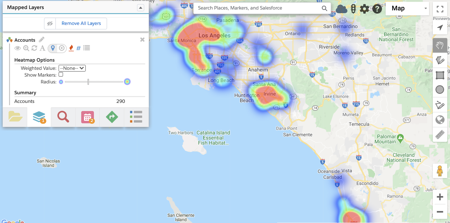
Heat mapping displays your data across the map using color-coded areas to show concentrations of records in an area. Thematic mapping, on the other hand, allows you to see concentrations by boundaries you set instead of hot spots.
Both of these capabilities work to condense large amounts of data for quick understanding of both your big picture and next steps.
Acting on Next Steps from the Map
Without Geoanalytics, you also have no way of intelligently scheduling your time or managing your territories. Data itself has limitations, but Geopointe swoops in to take care of it all.
From managing territories to scheduling appointments, visualization is needed when making plans around your data.
From the map, you can design and assign territories all from a visual perspective. Shape Editor and Automated Assignment features streamline the process to see the overall impact of your territories with regard to revenue, number of accounts, etc. before making any decisions. Automated Assignment then lets you distribute leads and manage territory assignments instantly.
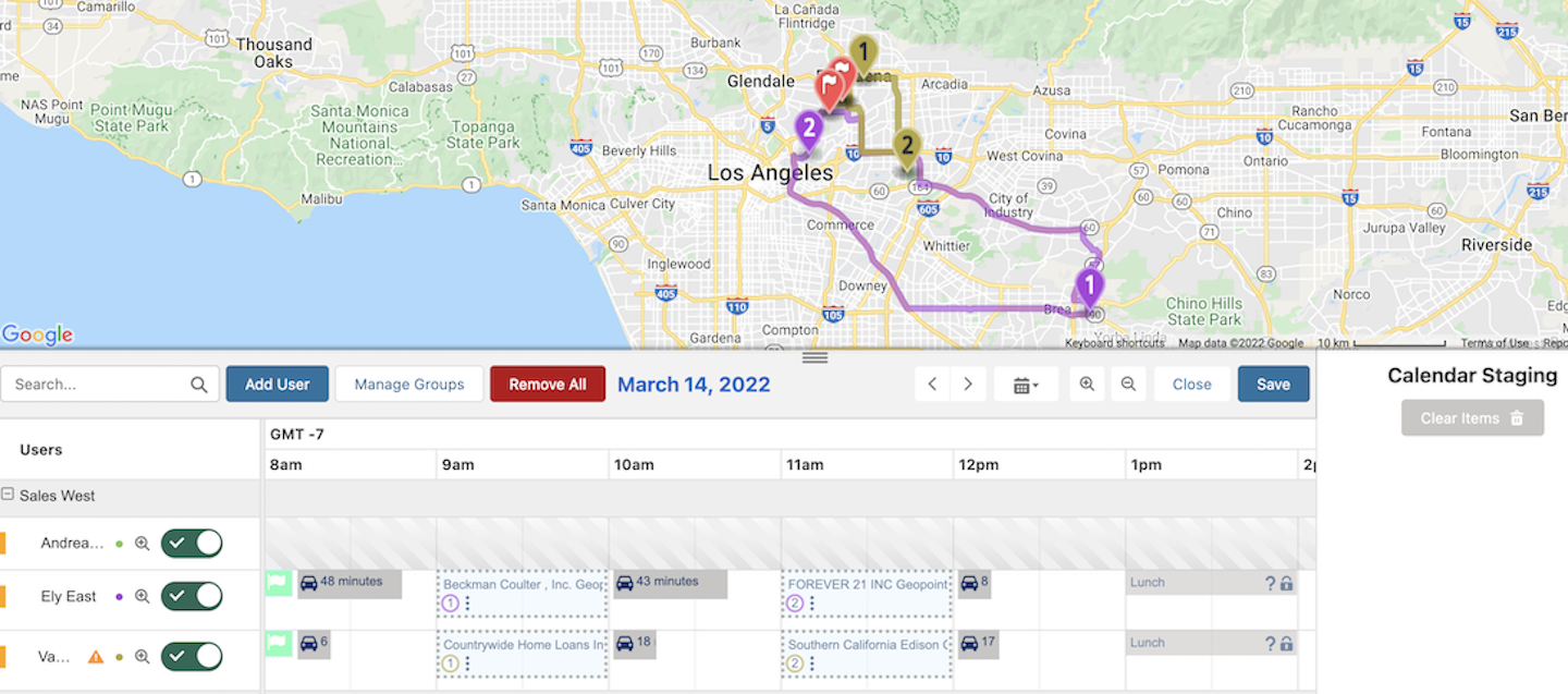
There will likely come a time when reps assigned to those territories will need to make appointments. How much easier would it be to manage a schedule from a geographic perspective? The answer is “a lot.”
Using Calendar-Based Scheduling allows you to visualize your scheduled travel plans and update events or appointments while on-the-go directly from the map. The Resource View Groups option makes it easy to compare multiple calendars and schedule out ahead of time.
Seeing is Understanding
If planning, executing, and managing all aspects of work the Geopointe way sounds too easy, then it’s definitely time to ditch the spreadsheets.
Your brain demands the very same visualization that’s offered by Geoanalytics software like Geopointe.
Seeing, as science tells us, is understanding. From that understanding, you can make clear decisions and take the right action for your business.


