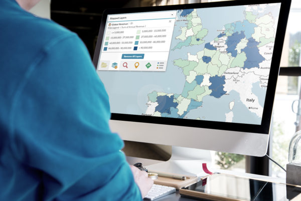
Mapping isn’t just for reps to plan their days or managers to plan territories —it’s a useful tool for executives as well. Mapping can be used as a visual reporting tool, making reports more digestible and understandable at a glance. Using maps, executives can see everything from the smallest details via charting to the big picture using geographic searches. Here are some ways executives can get the most out of mapping technologies.
Geographic Searching Analysis
Executives are usually most concerned with the big picture and bottom-line results, for good reason! Having a bird’s-eye view of your organization’s progress towards goals is important to measure success and make necessary adjustments throughout the year. This is why Executives can get the big picture with mapping through geographic searching and analysis. This can be a helpful tool for executives to get an inside look at where their company is in comparison to goals and initiatives.
Enhancing a map through filters can help an executive get an idea of trends on a smaller or larger scale as needed, potentially uncovering hidden patterns within their vast amounts of data already in their CRM. This can be done by overlaying various types of data criteria on a map to view how the data interacts, uncovering trends that may not be obvious at first glance.
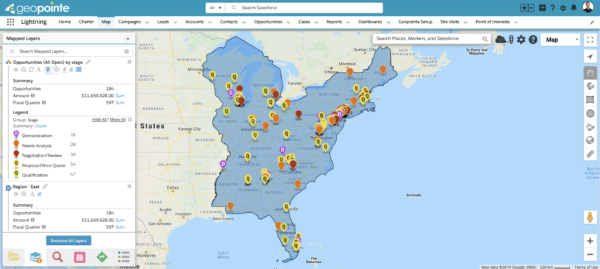
For example, the screenshot above shows opportunities by stage which is great for executives to get an idea of where their deals are. If it’s getting close to the end of the quarter, this view will clue executives into just how close every deal is to closing, and therefore, how likely it is for quota to be met. The map adds that extra dimension a list view or report cannot: a geographic understanding of where your records are and how they relate to each other in proximity.
The ability to see your organization’s records and how they relate to each other in proximity is important to keep a pulse on your organization’s progress towards goals, making it a valuable feature for executives.
Thematic Mapping
A thematic map focuses on multiple themes or subject areas such as revenue, opportunity size, or account owner. These are especially useful to executives because they provide an easy way to see the big picture in a variety of measures. Executives are able to view and pull reports based off of these filters, making existing trends more obvious. Seeing data grouped by geographic regions allows for quick comparisons of different territories. Executives can use this view during presentations as their color-coding makes them easy to digest at a glance.
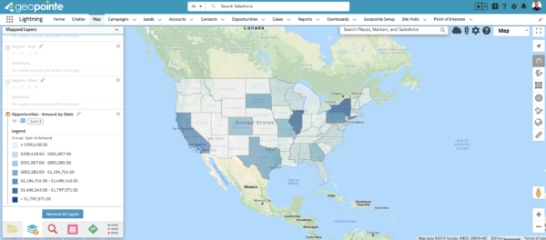
For example, the thematic map above is looking at account opportunities by state, the color-coding allows executive teams to quickly see which states have the largest and smallest opps, exposing which areas may need more focus by the team. This makes thematic maps an excellent resource for executive leadership and strategic planning.
Heatmaps
Heat mapping represents values with color-coding so you can make insightful decisions at a glance. Executives can build heat maps based on various objects such as record count, or by a numeric field like opportunity size or annual revenue. Heat maps show hot spots where the object is concentrated.
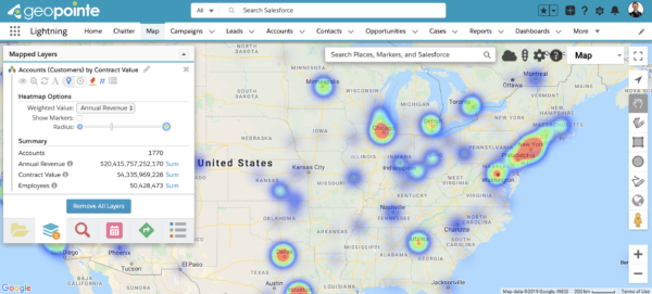
This allows executives to get the big picture with mapping by zeroing in on areas of interest and further investigate the opportunities within. Heat maps can also be used in conjunction with territory boundaries, offering executives a unique view of which territories have the hottest or largest opportunities, gaps, trends, or ideal target locations for outreach whether it be in-person or over the phone.
Charting
Sometimes executives need to see more than just a map to decipher their data which is where charting comes in. Charting involves taking data directly from the map and placing it into a graphic. Charts allow executives to do additional analysis using pie charts or bar graphs, grouped by any location or territory. Map-based, interactive charts are important for executives because they allow you to visualize your data in yet another way using pie charts or bar graphs and group using a variety of fields including state, opportunities, status, account type, or any other fields.
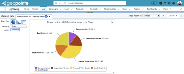
In the screenshot above, we are once again looking at opportunities by stage, this time off the map. Map visualization allows you to see data in various ways such as charts and heatmaps which offers a different view than before which is helpful depending on the person and what they prefer
Mapping technologies are crucial for executives to have a clear understanding of their organization’s data. Solutions such as Geopointe provide executives with visual reporting using geolocation for an at-a-glance understanding of different aspects of their business. Executives can get the big picture with mapping by putting their Salesforce data on the map with Geopointe to help drive decisions that increase productivity. Request a free demo today.


